
See our Book Cover Concepts
We need your vote!

This is the exciting part, where we get to put a wrapper on the ReJESUS Everything book. Let me set the background. This book is for 20 to 40-year-olds who are Christians and are disappointed with Christianity for various reasons. I'm trying to show them a path to the renewal of their faith and a direct relationship with Jesus. I want it to be a bold book they need to engage.
If you are someone who is totally happy with everything in Christianity as an enterprise, your personal connection with Jesus and your church life this might not be a book for you, but if you ask your children, grandchildren, or friends, you may find that it's just the book they need so they can stop the downward slide of their inner life.
Rebuild a faith that can endure even the crazy times that we are in.
The Cover
We want a cover that will jump out at them and provoke them to pick it up and open it. It can't just be a gentle devotional on the 23rd Psalm kind of book cover.
This is our current art direction. The actual cover in the end may be significantly different, but we need some feedback from different groups of people most likely to win in the battle for their attention. What we really need is for you to vote for the concept you think would get your attention.
Please spread this email as widely as you can to the age group we are trying to connect with. I'm excited to see how you vote. We are doing this together, and I really appreciate your partnership.
Photo one is below
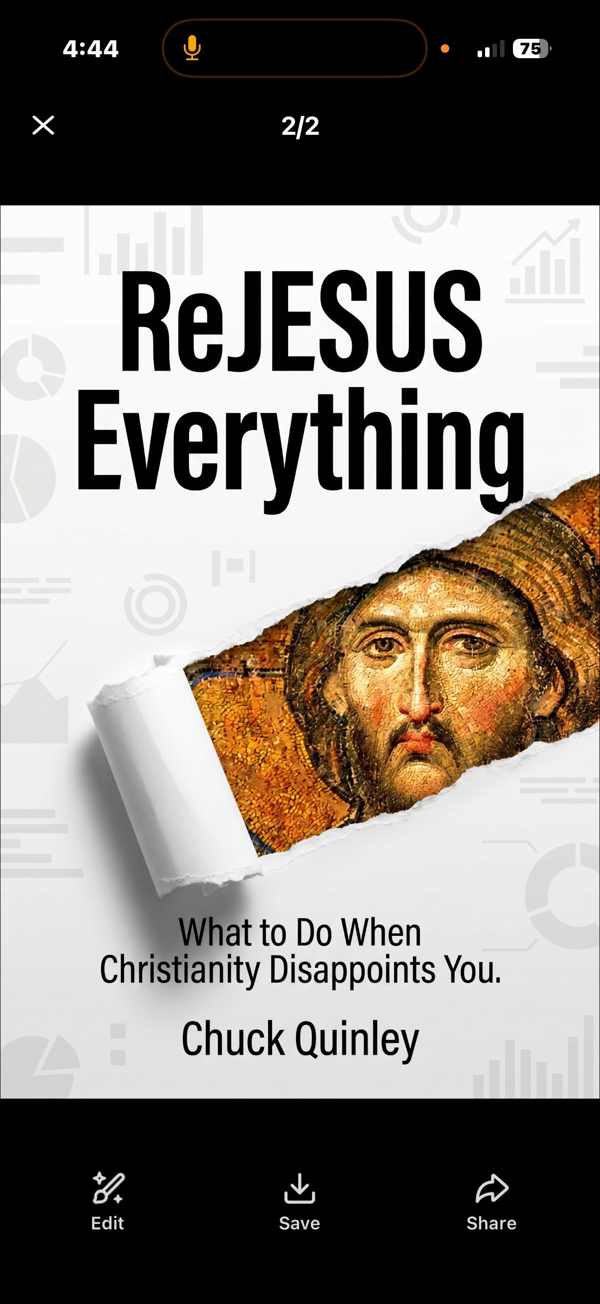
Photo two
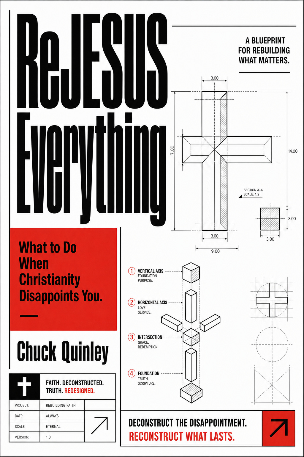
Photo Three
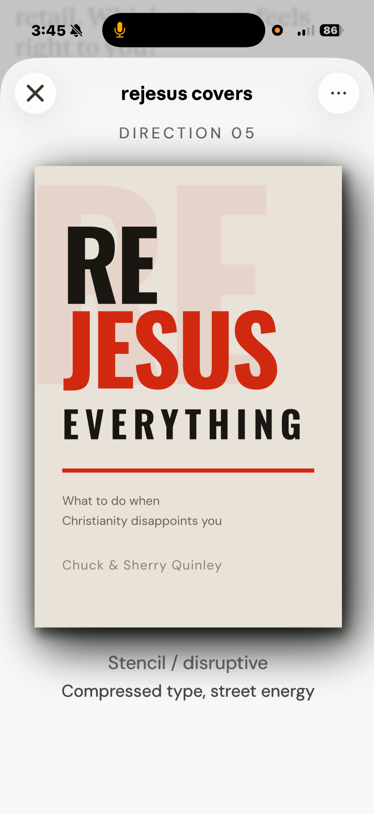
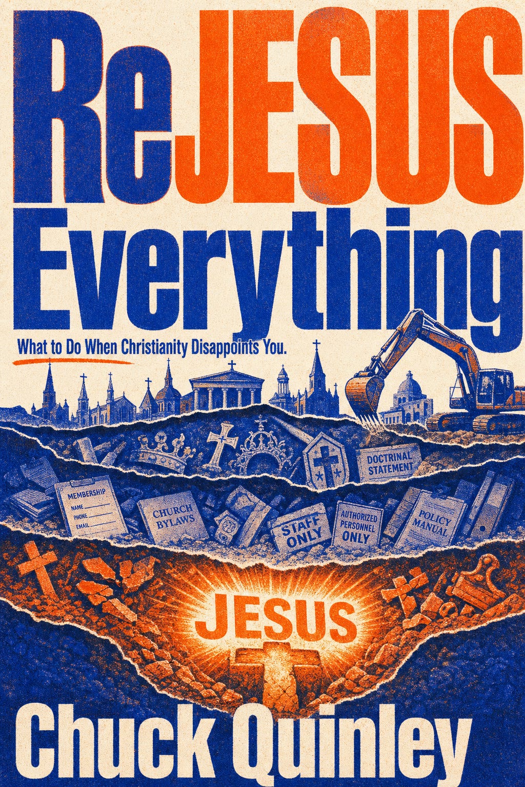
Photo Four
Thanks so much!!!
Chuck and Sherry
Photo One is awesome, I love the peel back look and let's dive deeper feel, but I think for a younger crowd who might not like an academic look, photo four would be the best selection. Photo two is excellent also but just way too busy for me, but young people seem to like that so? Photo three is very nice, simple, to the point, but not sure if it pops enough. My vote, number one! But I will send this e-mail to three individuals (my children) that meet your criteria. One is 36 and a radical believer searching for more truth. The other is 39, a believer, but does not have time for church, (too busy chasing money). And the oldest, 41, walked away completely after two tours in Iraq (he doesn't want to hear it anymore).
My opinion:
Photo 3 is the best one. You can read it in 2 seconds. The color scheme fits together. It’s the most pleasing one to the eye.
Photo 1 is a very close second best, but looks like it belongs in a college bookstore.
Photo 4 is way too AI. If you’re going for an older audience, they may like its symbolism. However, my two girls both hate AI with a passion and I’m learning that’s a common theme in the teenage market place.
Photo 2 is way too noisy. I got lost in it. It seems like an IKEA Directions Booklet for a cross.
Rosa (13yrs old)
Photo 1: My favorite. It looks interesting. Who is that guy? (Me: old painting of Jesus) oh. Yeah. I like it.
Photo 4: it’s eye catching. I like it. If it’s AI, its goes to last place. AI is cringe. Get some talent. They’re putting AI books in Barnes and Noble and that’s not good.
Photo 3: I like it. Simple.
Photo 2: I don’t like it. It’s way too confusing. It looks like I learning how to make a craft.